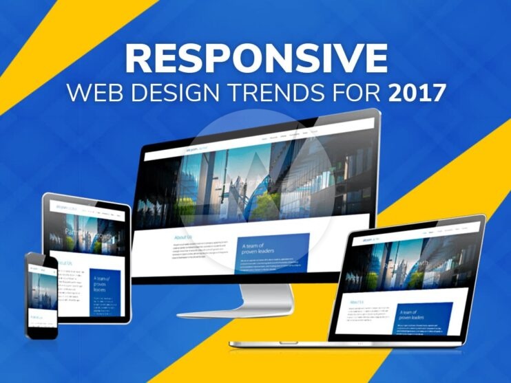
Responsive Web Design Trends For 2017


As we take on a fresh new year, the one question that is likely to be on the minds of designers is which trends are likely to dominate web design in 2017.
Here is a quick overview on some Responsive Web Design trends that will make it big as the year unfolds:
Personalized Visuals
A picture, it is said can speak a 1000 words. In fact there is nothing quite like visual storytelling when it comes to web design. However tempting it may be to use stock visuals, there is only so much you can do with it. After all they haven’t been custom designed to tell your unique story. Also, the very fact that the users have seen the visuals across different contexts comes in the way of telling a compelling story. All this and more makes the case for developing personalized visuals to tell the brand story. While stock visuals have ease of use and economy on their side, it is sites with personalized visuals that create visual appeal and a unique website experience. In the long run therefore personalized visuals land up scoring on the ROI aspect as well. Original photography is one trend that is bound to gain traction as will animation as it will help the brand engage with audiences.
2017 is also big for the use of SGVs or scalable, vector graphics. Not only do they look great on any screen, they do that without slowing down the site. 2017 will also see the growth of custom icons. They not only help the brand to stand apart, they also assist in easy navigation as well as to lay emphasis on call-to action. The year will also be the one for bold color choices that add a dash of character and personality to the website and of course to make them stand apart. Big, bold typography that is easy to read will be another trend that will add to the visual appeal. Check out more Responsive Web Design Trends to take your site to the next level.
User friendly interface
Clearly the focus for any website is its users and hence improving the customer interface and keeping it user friendly will further gain importance in 2017. From the design perspective, a number of factors will go in to improve the user experience, primary among them being:
- Creating a realistic interface by using Google’s Material design.
- Full screen forms – Taking away the need of a separate page to load, full screen forms tend to be less disruptive.
- Image based navigation- With the use of custom images, the use of image based navigation will also increase, adding to the user interest. What will also be in vogue will be the card based layout, enabling greater content to be displayed in one go and thereby improving the functionality. With cards allowing users to filter content as per their own requirements, it allows for greater customization. This layout also works well with continuously depleting attention spans, as it enables users to find the content that they require easily, thereby engaging them to spend more time on the site. In fact the one golden rule for 2017, when it comes to choosing layouts, is to choose one that allows the content to stand out. Flatter and minimalistic designs are therefore, likely to rule the roost.
- Parallax Scrolling- Ease of navigation will also be enhanced through features such as parallax scrolling where the background moves at a slower pace than the foreground. As a visual tool, it gives the site a degree of polish and depth.
Mobile first approach
While mobile first isn’t a brand new concept for 2017, its importance will only grow with mobiles often becoming the primary screen for browsing. 2017 will increasingly see web designs being customized to deliver content to smaller screens, rather than being an add-on to the desktop version. Designing for a smaller screen, in turn will mean a thorough analysis of the various components of the website and doing away with any irrelevant ones. Watch out how to optimize your website for Mobile-First Design.
Designing for performance
While designing a website, the one aspect that any designer cannot afford to ignore is its speed and performance. In choosing the design elements of the site, therefore what needs to be kept in mind is that its performance is not impacted as not every design decision may weigh in favor of performance.
Over all with focus shifting towards humanization of the brand the role of design is only slated to increase. With a lot available in the designer’s toolbox, there is likely to be greater collaboration across design and development teams. In fact 2017 is likely to see the silos of designing and development break down as the two functions merge seamlessly. If one was to sum up the overall design philosophy for 2017 in two words, it would have to be “inclusive thinking”.
Skynet Technologies is a Business Process & IT Consulting firm offering a vast range of Business Processing, Responsive Web Design, Mobile Application Development, SEO Services, Custom Shopping Cart Solutions, IT Consultancy and other Value Added Services globally from the USA, Africa, Australia and India.
If you are looking for a Website Design Services, UX/UI Web Design, Online Store Design, Ecommerce Website Design, Please Explore our Website Design Services! We also provide Website Redesign Services, Online Store Redesign and Ecommerce Website Redesign Services. For More Information, Please Visit Our Website Redesign Services!