Mobile First Web Design & User Experience – A perfect Blend!


The customer is always right. This is not a hackneyed marketing phrase, but a principle from humanistic economics that unfolds completely new power in the free market of modernity.
You can build the perfect car, cook the most delicious food in your restaurant, or offer the optimal workout plan in your gym: if nobody uses your services, it is simply not a very good one. It doesn’t matter how convinced you are of your offer. If the customer refuses, it’s a bad product. In the end, this can be reduced to a simple formula: A product is only good if it meets the needs and wishes of the customer.
Why should web designers be real contributor successful mobile first web design?
We all know this moment from our own user experience: We call up a page on the Internet and an application does not work as it should. It takes less than two seconds for us to break off the process and turn our backs on the side – and in the worst case also on the company behind it. However, if the site rewards our click with a clear and intuitive problem solution, it says: Dopamine free! And we connect the site – and in the best case also the company – with a positive user experience.
The power over the so-called User Experience (UX) is held by those who build the website: the web designers. Because they take care of the functionality, the performance and the design of the site. But the same applies here: It is not the web designer who decides whether the site is good – but the customer. Do you find your homepage appealing? Great! But if no online user finds what is looking for and leaves the process disappointed, then you have obviously done something wrong. To prevent that from happening, you should know what is important in web design: customer focus! Mobile first web design and user experience can be the perfect blend for web designers to achieve top search engine rankings and success.
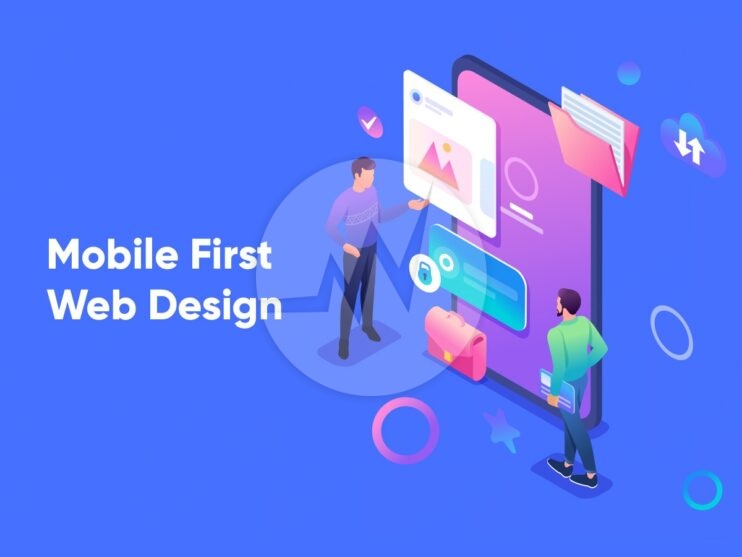
Mobile first Web Design:
The idea behind Mobile First web design arose from the increased use of the Internet on the go. We all must optimize website for Mobile First web Design in order to attract more audience. Many large companies jumped on the bandwagon and began developing websites for mobile devices first. This mobile-friendly view adapts to the respective screen size of the mobile device using responsive web design. The desktop version will only be added later.
What works on mobile devices cannot, however, simply be transferred to user behaviour on the desktop. In the worst case, this leads to breaks in usage habits. Nevertheless, of course, nothing speaks against it and it is even expressly recommended to adapt your own site to mobile devices. Because even worse than a mobile version on the desktop is a desktop version on the mobile device: too large displays for the small screen, impractical buttons and endless loading times are an absolute killer for surfing pleasure.
User experience is first thing: Customers know best what is good.
Which came first: the hen or the egg? The same question arises when building a website: desktop or mobile – whichever comes first? It’s good that web developers have a clear answer to that: neither. Why? Because the question is the wrong one!
The focus is now different: the customer. So, the question is not how I can best display my website mobile and, on the desktop, but rather:
What does my customer want?
More accurate:
With what intention does the user come to my site?
More precisely:
What situation are my customers in?
What are their needs?
What are the challenges you face?
Depending on the device, these questions result in different situations, behaviours and expectations of customers.
Variant 1: The customer sits at the desktop.
- Situation: The user is at home or office.
- Behaviour: The user browses various websites. User has a rough goal, but probably no clear idea of it.
- Expectations: The user wants to get information in order to create a basis for decision-making for a certain action.
Variant 2: Customer uses the smartphone.
- Situation: The user is on the move.
- Behaviour: The user has a specific goal in mind and is looking for something very specific.
- Expectations: The user wants to find essential information quickly in order to carry out a certain action.
To further tailor your content to the user, you should also find answers to the following questions while also keeping your industry in mind:
- Does the user just want to find out more or do a specific action (e.g. contacting us, requesting an offer, etc.)?
- How does the user feel in their current situation?
- Are we moving in an industry that is “simple” for the user or one that needs to be explained?
- What fears and risks are there that can possibly be absorbed?
User first web design:
To cut a long story short: We will make the whole thing clear with an example. Let’s say we’re building a website for a product.
First of all, let’s ask ourselves the most important questions:
- What does the customer want?
- With what intention does the user come to my site?
To answer these questions, we need to consider different scenarios. If the user is currently on the go and calls up my page on their smartphone, their expectations are certainly different than when they sit quietly at home in front of the screen.
On the smartphone, contact details and the address should be the first thing the user sees.
On the desktop, on the other hand, it is more likely that the user would like to get a thorough impression of the company, event and service options. This in turn gives rise to different ideas regarding the structure of the website. Check out how to prepare your website for google’s mobile-first indexing.
Smartphone:
- Telephone number (+ click-to-call button)
- Address
- Opening hours
Tablet:
- Most important part of the navigation
- Image + first information
- CTA button
- Link to the menu
Desktop:
- Full (drop-down) menu visible
- More pictures
- Additional information (such as company history, short biography, news, events, services options)
- Inquiry form
Custom mobile-first web design – for you and your customers!
There is an incredible number of websites on the Internet that make the user experience not a success, but a real frustration. If you want to make sure that customers find exactly what they were looking for on your site, leave the creation in the professional hands of our web designers from Skynet Technologies. Thanks to our diverse industry experience, we know the needs and expectations of your target group in order to build an appealing website that both you and your customers like.
If you need help optimizing your mobile website, we are happy to assist you! If you are looking for a website design services, mobile-first web design, UX/UI web design, online store design, ecommerce website design, Please explore our website design services! We also provide website redesign services, online store redesign and ecommerce website redesign services. For more information, please explore our website redesign services!