Top 15 Ways to Improve your Website Design for Great User Experience

By | Date posted: | Last updated: May 31, 2021
UX Website Design

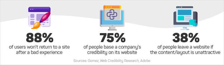
50% of the hindrances in sales and 40% of the losses in the audience are caused due to the failure of knowing the exact fixation time of the user on a webpage. If you want to improve your business and sale, capturing your reader’s attention within a couple of seconds with the help of your website design is the key.

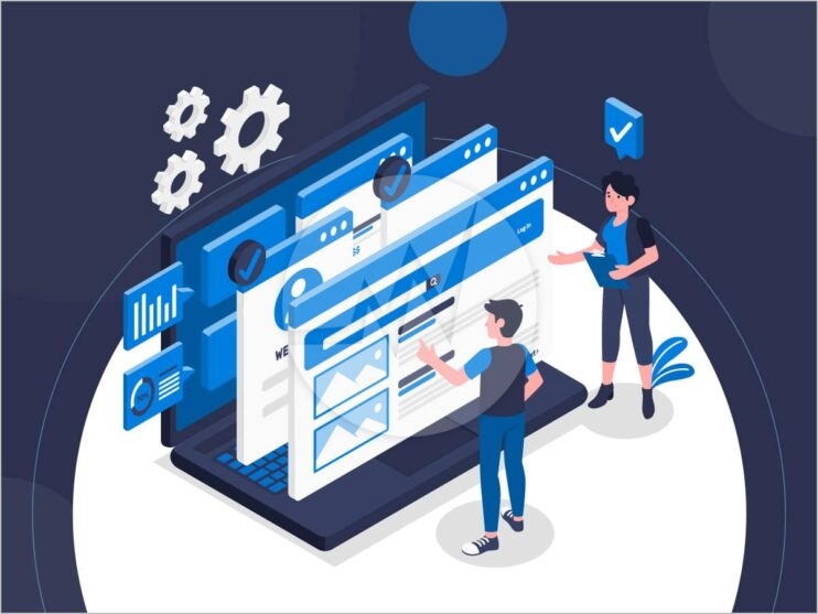
The 15 Proven ways for a better UX UI web design:

1. Fewer words catch more attention

Users don’t read instead they scan; i.e. only 30% of the content is read. Extra information makes almost 65% of the audience to leave the page. Incorporating key content in a website design serves to provide the best UX/UI web design service by making it easier for the customers to get the product/service they are looking for.

2. Know the screen position

Including the following into website design, transforms it into a good UI/UX web design. Key content should be placed in the upper-left quadrant of the screen, important services of the brand in the center, which drives most of the attention. All the other information buttons should be placed in a vertical format and the headline should be put in a horizontal format for best results.

3. Speed the upload time

Online shoppers prefer high-quality speed and quick network services, thereby expecting everything to load and move faster. Therefore, whenever the waiting time increases on any website, it hampers user experience. So, it is essential to avoid such situations by making smaller file sizes of images, scripts, style, sheets, and other features in the website design; features that result in a slower speed and increased frustration.

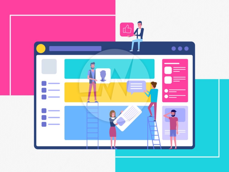
4. The layout of the page

For making appealing layouts, balancing the textual and visual content in the web design like images, slide shows, videos with proper sharpness and clarity is a pre-requisite as it aids in improving the overall user experience for the customers.

5. Visual and typographical order

Avoid overdoing with different sheets and colors variations and limit your task to only four different texts and colors. Text format like H1, H2, and H3 for the title, heading, and subheading respectively works well. The body should be broken down into smaller paragraphs. Important contents should be put in bold and larger sizes with warm colors. Combine all appealing techniques and it will give you a good UI/UX website design service.

6. Blue Links

Blue colored links, which change color on clicking helps to provide feedback response. Links should be descriptive enough to tell the user about its landing page.

7. Use old convection Methods

Using old formats leads to faster recognition by providing a hassle-free journey to the users. Certain things should be placed on top right or in the center on the page like navigation menu with contact details to ensure ease for consumers. The logo and call button should be placed on the top left corner. The search feature should be in the header and last but not least, the footer should consist of social media links.

8. User-friendly format

Create an UI/UX website design for kids using short paragraphs to break down long information, using multiple headings to catch their attention faster, fonts like Helvetica, axial for a clear view to highlight the content also by using bolds and italics. Make colorful content on a simple background. And make sure to include clickable icons, links, and tabs in the website design.

9. Notify about the navigation

Tell visitors about the navigations, by placing it in the top-right in the UI/UX web design, with the other important icons like home, about, contact, login, or sign up. Include various links to help them reach their goal product or services. Download now, contact us, buy now are important buttons of website design as well, which need to be placed judiciously.

10. Update to get UI/UX website design

Designing a website as important as maintaining it. By making UI or UX website design, your search engine optimization improves, which makes reaching your goal easier and faster with less investment of time, money, and effort. A good website design gives a responsive service.

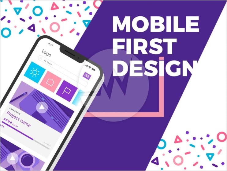
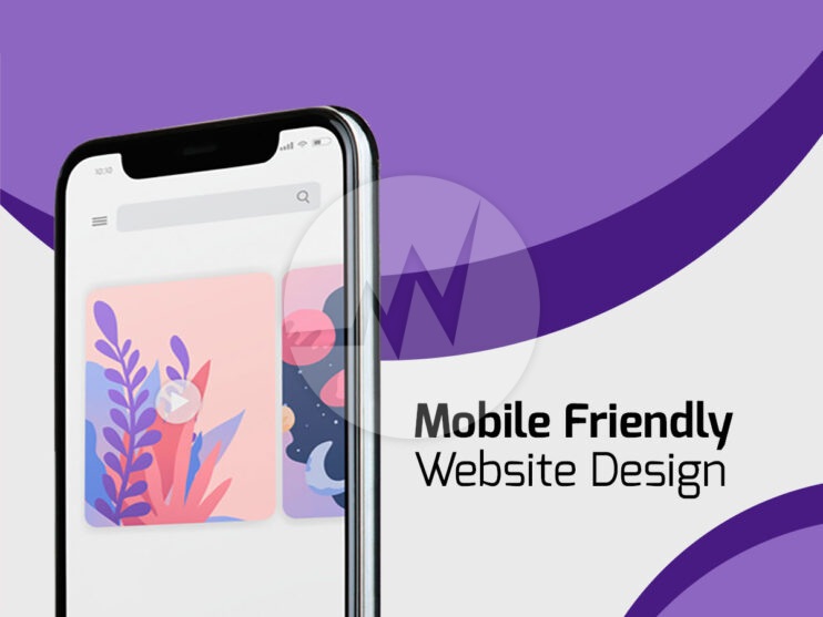
11. Responsive and device friendly website design

A website should look appealing on all screen sizes and be adaptive to all devices, which improve user experience, making it easier to code and manage. Resizing the browser size makes it adaptable.

12. Feedback mechanism

Analyzing people’s visits to the website and their actions will give you valuable information about their online experience. Implementing a trial-error method makes for a good UI/UX website design that suits the tastes of the users, making you aware of their likes and dislikes about the web page.

13. Legal usability and website security

Before going live, checking the minute details about UX/UI website design by examining it along with the government usability recommendations is necessary.

By pondering special attention to website security, you can easily add a trusted tag to the website and lower the chances of customers leaving the page. Users are afraid because they are concerned with the safety of their personal information. Display all the necessary security features throughout the website design page for increasing their likeliness to buy.

14. Do good homework

Study about your brand or company’s and its primary mission, target audience, and core values before sketching out a UI or UX website design. To stand out in the competition studying your audience’s persona and goals is crucial.

15. A design like a customer

On viewing the website as a customer, you may come across several gaps and elements overlapping and conflicting with each other. Brainstorm all possible perspectives to funnel in the sales. Checking the basic things like, are the links are clickable? What is the speed of form submission? Is the flow of the webpage design smooth? Etc. is highly essential.

Conclusion

If you want to drive in more customers and make them focus on the key elements in your UX/UI website design, knowing the expectations of the user is the priority. Designing according to their preference will make them realize your concern and care towards online shoppers and develop a sense of trust.

If you are looking for a website design services, UX/UI web design, online store design, ecommerce website design, Please explore our website design services! We also provide website redesign services, online store redesign and ecommerce website redesign services. For more information, please explore our website redesign services!

If you have any questions or would like to know more about how Skynet Technologies can help your business to reach one step ahead, Reach out us through below form & We'll get back to you soon!

How to Optimize Your Website for Mobile-First Design?

By | Date posted: | Last updated: June 8, 2021
Mobile First Web Design

The popularity of mobile devices, i.e. smartphones and tablets, has been increasing for years. In today’s fast-paced world, they are therefore indispensable. More searches now are done on mobile devices than on desktops. A mobile-optimized website is, therefore, a must! Google has long responded to this: With the Mobile-First Index, Google has implemented a new ranking principle that makes mobile versions of websites a subject of evaluation. The user-friendliness of your mobile website thus decides your place in Google’s search engine ranking. Especially, now you should understand why it is so important to have a mobile first website design. In the following, we will show you what needs to consider and what optimization options there are for mobile websites.

Use Mobile First Index Era as SEO friendly content for your website

With Mobile-First Indexing, Google rates the search results based on the information found on the mobile version of your website. This means that only the content on your mobile website is taken into account for the ranking. Previously, the content of the desktop version used for the index. However, since the use of mobile devices for a Google search is increasing, the Googlebot crawls and indexes pages with the smartphone agent. Information that the “mobile” crawler was not shown is not taken into account in the ranking and can have a negative impact on the Google ranking. Regardless of whether this information is available in the desktop version. Mobile end devices are becoming more and more important, and so is the mobile Internet. Because of this, a short loading time must ensure when creating mobile websites. The content formats must also adapt to smaller screen sizes. There are different ways to build a mobile version of your website.

Here we present the most important ways

Here we present the most important ways:

Be Creative for desktop and mobile URLs

Here the mobile and desktop versions of the website are provided on different URLs. An attempt is made to recognize the user agent of the user in order to then forward it to the corresponding version. So that Google does not identify and penalize the two URLs as duplicate content, a connection to the identical websites must be created. The elements rel = “canonical” and rel = “alternate” are used to establish the relationship between the two URLs. Website content should be unique and unique.

Utilize Dynamic Provisioning Approach

With dynamic provisioning, all devices use the same URLs. Depending on which user agent is recognized, you will receive different source code variants (HTML and CSS). This depends on what the server can find out about the visitor’s browser. An important element in this approach is the Vary HTTP header. This decides which source code its outputs and then forwards the resources to the end device. The requested content is therefore adapted to the user agent of the respective end device using the Vary header.

Use Accelerated Mobile Pages (AMP) to speed up

Accelerated Mobile Pages (AMP) is an open source framework that speeds up the loading speed of websites on mobile devices. The framework is characterized by reduced JavaScript and CSS elements and the loading of content elements via a content delivery network. This has the advantage that the page can be set up quickly regardless of user location. The key to AMP is primarily to reduce the amount of data that needs to be loaded for the page.

Responsive web design optimization

The responsive design provides the same HTML code regardless of the end devices used and uses CSS to vary the display of the content depending on the screen size. This means that the layout of a website automatically adapts to the output medium and ensures a good user experience. The core of the responsive design is the use of flexible design grids and flexible content. Relative pixel values are used instead of fixed pixel values. Another essential element is the Viewport meta tag, which tells the browser how the dimensions and scaling should be adjusted according to the width of the device. This enables the display areas to be automatically adjusted as a percentage.

Conclusion

In summary, we recommend a responsive design for the optimization of your mobile website. Responsive design is the most common and flexible way to optimize your mobile website. It makes it easier for the user to share and link desktop and mobile content via the same URL. There is no need to create thousands of layouts for the multitude of different screen sizes. The responsive design automatically adapts to the output medium. Maintenance work is reduced for the operator of the website. The maintenance of the different pages (desktop and mobile) is not necessary since it does not have to be done twice. Google algorithms can be precisely assigned to indexing properties. It is not necessary to signal that a desktop and a mobile version are available. The loading time with responsive design is shorter since no forwarding is necessary to get a view optimized for the respective device. In addition, user agent-based redirects are more prone to errors, which underlines the user-friendliness of responsive design.

If you need help optimizing your mobile website, we are happy to assist you! If you are looking for a website design services, UX/UI web design, online store design, ecommerce website design, Please explore our website design services! We also provide website redesign services, online store redesign and ecommerce website redesign services. For more information, please explore our website redesign services!

If you have any questions or would like to know more about how Skynet Technologies can help your business to reach one step ahead, Reach out us through below form & We'll get back to you soon!

Top 10 Tips for Choosing the Reliable Web Design Company!

By | Date posted: | Last updated: March 22, 2021
Web Design Company

Introduction

In today’s fast-paced digital age, there are more than 1 billion websites currently up and running. These websites serve as the first exposure with a prospect or customer, and hence it is quite important to make sure you get the best first impression! Websites with aesthetic appeal and visually enticing will help convince the visitors to stay on and engage, thereby, improving your business at an exponential rate. Poor website design could break their overall impression about your business which mars credibility and hurts brand image, in turn driving away from potential customers. Therefore, it’s important to invest in a professional website design that communicates effectively with customers/prospects and improves brand awareness, conversions, and sales.

A leading web design agency understands the role of prototypicality and visual aesthetic judgments regarding the first impression of websites. However, it’s a herculean task finding a professional web design agency that not only creates great aesthetic appeal but also creates responsive websites and empathizes with the visitor to make their overall UX a great one. You have to rigorously search for agencies, look into their portfolios, and may still end up making a poor choice.

We are here to help you find the best website agency. Finding solid answers to the following 10 questions can help you in minimizing the risk and making the right choice!

1. Agency Track Record and Expertise

Look into the portfolio to find a slew of client testimonials, case studies, and SERP results. The previous work would throw a light into the industries it has provided the designs. See if the designs are varying as per the industry to find out how creative and versatile the agency is. Make a quick background check on the user pain points of the previous clients and see how the agency resolved them. This could give you a fair idea of how they would serve your purpose.

2. Reviews and Credibility

Happy customers are the best indicators of the agency’s work and the agency portfolio may provide the details of client testimonials and success stories but they could also be hyperbole with misleading and false information. You could verify their claims with the third-party sources like Awwwards, Behance, Clutch, Dribbble, GoodFirms. You can also look into their directories to find the top-verified design agencies and freelancers in the industry who could match your requirements.

3. Workflow and Deliverables

Understand the agency’s workflow to gain deeper insights into their business model and to set reasonable expectations and timelines.

A. Project Discovery

Find out their method and approach to understanding the problem, defining goals, and outlining a strategy to work on your pain point. See how well they research the needs of your target audience, understand their persona, do a competitor analysis, and come up with the user journey maps.
And finally how well they stick to the design best practices to make an engaging and competitive product.

B. Ideation Phase

Once the requirements gathering was over, they come up with the suggestions to solve your pain points, the sitemap, the user flow, and the whole structure of your project. They do the wireframing and come up with the mockups and see if they are as per your need.

C. Design Phase

A good web design agency understands that UI is not just about visual aesthetics. It needs a lot more than being creative, the UI designer needs to empathize with the user. Identify the potential problems, the latent frustration that the user may encounter, and come up with elements that makes the overall user experience a pleasant one.

D. Testing and Evaluation Phase

Before making the design go live, find out if the agency offers usability tests. Usability Testing will allow you to see which elements of your websites are performing well and which could be changed for better interaction. This could save several iterations for you by uncovering the broken and poorly designed parts on your website.

4. Setting a realistic timeline

Make sure you get the design calendar from the agency and monitor it all the while to see that the timelines are intact. Also, be prepared to face any unforeseen obstacles and hindrances that could affect your deadlines. Design done in haste could lead to more production issues and also be disastrous.

5.Pricing Policy

The pricing policy varies – could be project-based and hourly based.

A. Fixed Price – If you have a limited budget, you could stick to this plan as it is less risky. Any unanticipated additional costs that come up would be on the vendor himself. More ideal for short term projects and feature alteration projects with strict deadlines.

B. Per-hour basis – More flexible and ideal for projects where the scope of the work is unclear. Using time tracking tools, monitor the work to see there is no abuse. The product quality is high in this model.

No matter what model you use, get a contract by outlining all the details. However, sometimes, the devil lies in the details! There could be additional costs and hidden fees. So make sure you get the final cost for the project prior to signing the agreement. For small and medium enterprises, investing in a professional web design agency may seem daunting with the cost challenges. And if you are already having a working site, with the cost and time overruns, a redesign may seem unnecessary. But there are several agencies that offer professional, inspiring, and appealing designs without draining your entire marketing budget. Remember, getting a quality design is not an expense but an investment.

6. What technology is to be used?

There is a staggering number of platforms out there that could be used for your website by the agency and each has its own pros and cons. Find out the details and make sure the CMS used by the website design agency fits your marketing stack. Some of the popular CMS platforms are WordPress, Drupal, Joomla, Shopify, Magento, and more.

7. UI/UX Web Design Strategy

UI/UX design strategy should entail brand-building features and go beyond just visual elements. Thorough research on the demographics and winning niche design areas would help the agency to understand the trends that appeal the most to the visitors.

Also, make sure if your agency is working on a responsive framework that works well across varied devices. Ever since Google introduced a mobile-friendly algorithm, responsive website designs have become a necessity in order to be visible in search engines.

8. Extensive Services

There are several agencies that are prepared to go the extra mile for you and provide comprehensive solutions that could enhance your brand exposure through top-notch Search Engine Optimization(SEO) and other marketing strategies.

The best web design agencies maximize your online presence and improve your SERP rankings by combining the best designs with a highly optimized website. This increases your website traffic and most importantly, convert visitors to customers.

However, if they are not providing these services, make sure you come up with an SEO strategy that could be aligned with the website design process.

9. Test Task

Nothing speaks louder than this. You can get to assess the quality of their work and decide if you want to go ahead with the website design agency. You could also get to see their enthusiasm and work integrity during this phase.

10. Future Web Maintenance

Your job doesn’t end once the website goes live. You need to constantly update your website to rank better in the search engines. Make sure your website design agency is willing to monitor your website periodically and make design changes if required. They need to make sure that the website doesn’t go obsolete or get abandoned by the users due to broken links.

Conclusion

The design of your website can either make or break your business and you can’t afford to fail that might cause your prospects to bounce off your website. So carefully chose a website design agency that works meticulously to transform your business. Conduct thorough research on them and take stock of their portfolio without rushing into hiring one.

If you are looking for a website design services, UX/UI web design, online store design, ecommerce website design, Please explore our website design services! We also provide website redesign services, online store redesign and ecommerce website redesign services. For more information, please explore our website redesign services!

If you have any questions or would like to know more about how Skynet Technologies can help your business to reach one step ahead, Reach out us through below form & We'll get back to you soon!

Top 10 Reasons Why Your Website Design Must be Mobile Friendly!

By | Date posted: | Last updated: May 31, 2021
Mobile Friendly Website Design

Introduction

In 2020, the number of smartphone users is roughly 3.5 billion people which translates to 45% of the total world population. According to a study, mobile accounts for 52% of the global web traffic consistently above 50% since 2016. With such an astronomical growth of mobile phones, no mobile strategy means lurking the business future in the dark.

No matter what your business niche is, the market is surely present on smartphone platforms. With a majority of business and buying decisions happening on your mobile phone, you simply cannot rely on desktop-oriented websites and expect a great business outcome. Hence having a website that is mobile friendly is no longer optional- it’s imperative!

Read on how crafting responsive website designs help you accelerate your business’ online presence.

1. Mobile, Mobile, Mobile! It’s everywhere!

With each year, worldwide traffic is becoming exceedingly mobile-heavy. Most people out there access websites via smartphones instead of a desktop or a laptop. As per a report by Hubspot, about 61% of customers perceive a brand positively if the brand provides the best mobile experience. The contrary is true as well- poor mobile experience is driving potential customers to competitors.

By making Mobile responsive website design, you are offering a great experience to your visitors and ensuring your relevance through all the market upgrades and evolving technology trends.

2. It’s all about UX Web Design!

The average attention span of the mobile site users is less than 8 seconds. Responsive websites are visually appealing, load faster on mobile phones, and have intuitive site navigation. A poorly designed website will likely have a frustrating UX for smartphone users and they will be forced to zoom/scroll in to see text, struggle to fill the glitchy forms and will likely drive away your potential customers. So having a mobile-friendly website helps your users to find the information they need easier and faster.

3. Competitive edge – Stay ahead of the race!

Many of the companies are already transforming their online presence by making responsive designs a priority to achieve the unbeatable competitive advantage and win a brand power in the industry. And if you stay behind the race, remember that your user takes no time to chuck you out and go to your competitor.
So in order to contend against your competitors in your niche industry, you need to stay on the same playing field with responsive designs.

4. Cost-effective solution

Businesses earlier used to create separate websites for desktop and mobile devices and hence the overall costs used to run pretty high. But with the responsive design framework, the navigation changes automatically with respect to the type of the device and align your web pages to align with your mobile phone sizes. The design, development, and even the maintenance cost reduced to a great extent, and the benefit in terms of quality, ROI, and experience is immense.

5. Drives more Organic traffic

Google rolled out mobile-first indexing which made mobile-responsiveness a must-have trait for your website. This algorithm checks the mobile-friendliness to decide the organic rankings of the webpages and websites. Also, this supports high-quality link building and with just one link that gets shared everywhere. It made every business to switch to responsive site designs to acquire sustainable Search Engine rankings.

6. Foster rockstar conversions and sales

A huge chunk of your revenue could come from mobile traffic. With a mobile-friendly website, you give 24*7 access to your product/service to your prospects and customers. Your customers make a quick browse of your products on their smartphones, gather information, and make an educated purchasing. In a way, this improves your engagement rate and you can even expect higher conversion rates and better sales opportunities as well.

7. Augment your social presence

Social media platforms on mobile phones are most frequently used by the users and they are clicking through from your social networks to your website. Whether they are reading your blog or signing up for your newsletter, your website should guarantee a smooth user experience for these social visitors. Responsive websites also enable easy sharing on social platforms which improves your visibility. Creating a successful social media marketing strategy without mobile responsiveness is incomplete.

8. Competitive Speed recommendation

No user is ready to wait for more than 5 seconds and this impacts your SEO rankings, traffic, conversion rate, and revenue. These reasons enhance the necessity to ensure your website is mobile-friendly. Google PageSpeed guidelines also ask for a site to load within 2 seconds. But that won’t be possible if your website is not responsive.

9. CMS platforms support response designs

Millions of websites hosted using various CMS platforms like WordPress, Drupal and others also started using responsive themes. It is easier to maintain one responsive domain than to maintain unique mobile and desktop versions. A responsive website adapts its design to the device a viewer sees your pages on, without you needing to do too much tinkering.

Many CRMs allow you to use smart content, which can change based on who is viewing your page – such as inserting a returning visitor’s name in a heading or serving information based on the type of the device. So it’s better to have a site that makes educated adjustments on its own rather than manually adjusted.

10. Better your SEO

Running multiple versions (desktop and mobile) of the same website itself is a hassle and leading SEO consultants, firms, and websites are suggesting to invest on responsive websites. You can optimize the prime keywords of your business that potential customers may use on their mobile phones. You can incorporate mobile-specific keywords effectively into a responsive design website too.

You don’t need separate SEO campaigns for your desktop and mobile version of your websites anymore. Responsive websites typically load faster and improve the UX which makes the users stay on your website. Longer sessions and more click-throughs are great indicators of lower bounce rates and hence improve your organic rankings on the search engines.

Conclusion

By now it must be clear that no business can afford to move in the direction opposite to the market conditions, customer trends, and evolving technology upgrades. A mobile-responsive website covers all the factors that will be beneficial to all the stakeholders and hence it is an indispensable addition to your business online marketing arsenal.

If you are looking for a website design services, UX/UI web design, online store design, ecommerce website design, Please explore our website design services! We also provide website redesign services, online store redesign and ecommerce website redesign services. For more information, please explore our website redesign services!

If you have any questions or would like to know more about how Skynet Technologies can help your business to reach one step ahead, Reach out us through below form & We'll get back to you soon!