Best 50 Free Fonts For 2018

By | Date posted: | Last updated: May 26, 2021
Free Fonts 1

Following are some of best free trending fonts from Google Web Fonts.

Top recommended fonts from Font Squirrel

Top recommended fonts from Sans-Serif Typefaces

Top recommended fonts from Rounded

Top recommended fonts from Handwriting

If you are looking for a Website Design Services, UX/UI Web Design, Online Store Design, Ecommerce Website Design, Please Explore our Website Design Services! We also provide Website Redesign Services, Online Store Redesign and Ecommerce Website Redesign Services. For More Information, Please Visit Our Website Redesign Services!

If you have any questions or would like to know more about how Skynet Technologies can help your business to reach one step ahead, Reach out us through below form & We'll get back to you soon!

How To Build A Multilayer Parallax With Pure CSS?

By | Date posted: | Last updated: December 28, 2020
Multi Layer Parallax effect

Parallax is handled with JavaScript, more often than not. It is implemented with the the scroll event and modifying the DOM directly in the handler, triggering needless reflows and paints. All this happens out of sync with the browsers rendering pipeline causing dropped frames and stuttering. requestAnimationFrame and deferring DOM updates can transform parallax websites. Have you ever thought what if we remove the JavaScript dependency completely?

Parallax can be used for both separate images or the entire layout of the website. It is quite a universal solution for any project. Parallax with pure CSS will removes all the issues and allows the browser to leverage hardware acceleration resulting in almost everything being handled by the compositor. The result is consistent frame rates and perfectly smooth scrolling. You can also combine the effect with other CSS features such as media queries.


The theory

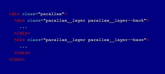
Before we dive into how the effect works, let’s establish some barebones markup:
pure css parallax

Here are the basic style rules:
pure css parallax scrolling

The parallax class is where the parallax magic happens. Defining the height and perspective style properties of an element will lock the perspective to its centre, creating a fixed origin 3D viewport. Setting overflow-y: auto will allow the content inside the element to scroll in the usual way, but now descendant elements will be rendered relative to the fixed perspective. This is the key to creating the parallax effect.

Next is the parallax__layer class. As the name suggests, it defines a layer of content to which the parallax effect will be applied; the element is pulled out of content flow and configured to fill the space of the container.

Next, we have the modifier classes parallax__layer–base and parallax__layer–back. These are used to determine the scrolling speed of a parallax element by translating it along the Z axis (moving it farther away, or closer to the viewport). For brevity we have only defined two-layer speeds – we’ll add more later.


Depth correction

Since the parallax effect is created using 3D transforms, translating an element along the Z axis has a side effect – its effective size changes as we move it closer to or farther away from the viewport. To counter this we need to apply a scale() transform to the element so that it appears to be rendered at its original size:

parallax scrolling

The scale factor can be calculated with 1 + (translateZ * -1) / perspective. For example, if our viewport perspective is set to 1px and we translate an element -2px along the Z axis the correction scale factor would be 3:

parallax scrolling css


Controlling layer speed

Layer speed is controlled by a combination of the perspective and the Z translation values. Elements with negative Z values will scroll slower than those with a positive value. The further the value is from 0 the more pronounced the parallax effect (i.e. translateZ(-10px) will scroll slower than translateZ(-1px)).
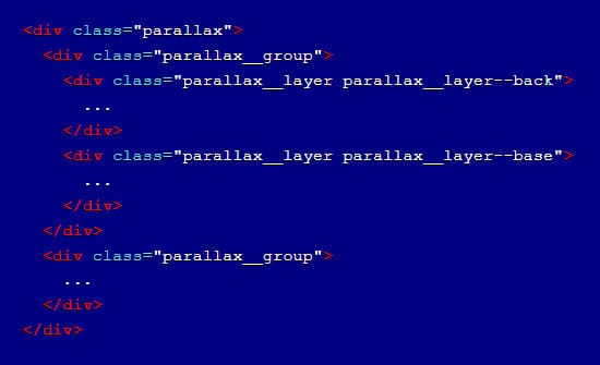

Parallax sections

The previous examples shows the basic techniques using very simple content but most parallax sites break the page into distinct sections where different effects can be applied. Here’s how to do that.
Firstly, we need a parallax__group element to group layers together:
parallax css

Here’s the CSS for the group element:
parallax effect css

In this example, we want each group to fill the viewport so we’ve set height: 100vh, however arbitrary values can be set for each group if required. transform-style: preserve-3d prevents the browser flattening the parallax__layer elements and position: relative is used to allow the child parallax__layer elements to be positioned relative to the group element.

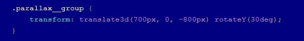
One important rule to keep in mind when grouping elements is, we cannot clip the content of a group. Setting overflow: hidden on a parallax__group will break the parallax effect. Unclipped content will result in descendant elements overflowing, so we need to be creative with the z-index values of the groups to ensure content is correctly revealed/hidden as the visitor scrolls through the document.

There are no hard and fast rules for dealing with layering as implementations will differ between designs. It’s much easier to debug layering issues if you can see how the parallax effect works – you can do that by applying simple transform to the group elements:
parallax effect


Browser support

  • Firefox, Safari, Opera and Chrome all support this effect.
  • Firefox works too but there is currently a minor issue with alignment.
  • IE doesn’t support preserve-3d yet (it’s coming) so the parallax effect won’t work. That’s ok though, you should still design your content to work without the parallax effect – You know, progressive enhancement and all that!

Click to view demo

If you are looking for a Website Design Services, UX/UI Web Design, Online Store Design, Ecommerce Website Design, Please Explore our Website Design Services! We also provide Website Redesign Services, Online Store Redesign and Ecommerce Website Redesign Services. For More Information, Please Visit Our Website Redesign Services!

If you have any questions or would like to know more about how Skynet Technologies can help your business to reach one step ahead, Reach out us through below form & We'll get back to you soon!

How To Use Clipping And Masking Techniques With CSS

By | Date posted: | Last updated: May 6, 2021
Clipping Masking 6

Clipping and masking are two commonly used operation in computer graphics which are used to hide some parts of elements and show other parts.

Clipping defines the region of an element that is visible. Masking is a method of ‘hiding’ a portion of an object based on another object. Masks are images; clips are always vector paths. Outside the path is transparent, inside the path is opaque.

Following is a simple example of using clipping and masking technique with CSS.


The Old/Deprecated clip

  • The first presence of clipping in CSS (other than overflow: hidden; trickery) was the clip property.
css clip

The New clip-path

  • The new, recommend version of applying clipping to elements in CSS is clip-path.
css mask
  • The new way to do this is with inset():
css clipping
  • clip-path though (in some browsers), is circles, ellipses, and polygons.
masking in css

Result

Web design

Using clip-path with an SVG-defined

  • You don’t have to define the clip-path value right in CSS, it can reference a element defined in SVG. Here’s what that looks like:
css website design usa

Animating/Transitioning clip-path

  • When you declare a basic shape as a clip-path, you can animate it!
web design css clipping

  • There was a WebKit-only version of masking where you could link up a raster image or define a gradient to be a mask.
css mask

Example:

Html Code:

<img class=”” src=”Image-path” alt=”” title=””>

CSS Code:

img {
width: 150px;
mask-image: -webkit-gradient(linear, left top, right bottom,color-stop(0.00, rgba(0,0,0,1)),color-stop(0.35, rgba(0,0,0,1)), color-stop(0.50, rgba(0,0,0,0)), color-stop(0.65, rgba(0,0,0,0)),
color-stop(1.00, rgba(0,0,0,0)));
}

masking in css

link up an entire SVG file as the mask, like:

css mask

Mask Types

skynet technologies

Border Types

  • The corners are used in the corners, the edges (can be) repeated along the edges, and the middle (can) stretch in the middle.
clipping mask

  • Different properties and even values have different support levels all over the place.
  • As far as prefixing goes: use the non-prefixed and -webkit- prefix on pretty much everything.

Some of Example of browser support:

css clipping
css mask
css mask
css mask
css mask
css mask
css mask
css mask

If you are looking for a Website Design Services, UX/UI Web Design, Online Store Design, Ecommerce Website Design, Please Explore our Website Design Services! We also provide Website Redesign Services, Online Store Redesign and Ecommerce Website Redesign Services. For More Information, Please Visit Our Website Redesign Services!

If you have any questions or would like to know more about how Skynet Technologies can help your business to reach one step ahead, Reach out us through below form & We'll get back to you soon!

Responsive Web Design Trends For 2017

By | Date posted: | Last updated: May 31, 2021
Responsive Webdesign

As we take on a fresh new year, the one question that is likely to be on the minds of designers is which trends are likely to dominate web design in 2017.

Here is a quick overview on some Responsive Web Design trends that will make it big as the year unfolds:

Personalized Visuals

A picture, it is said can speak a 1000 words. In fact there is nothing quite like visual storytelling when it comes to web design. However tempting it may be to use stock visuals, there is only so much you can do with it. After all they haven’t been custom designed to tell your unique story. Also, the very fact that the users have seen the visuals across different contexts comes in the way of telling a compelling story. All this and more makes the case for developing personalized visuals to tell the brand story. While stock visuals have ease of use and economy on their side, it is sites with personalized visuals that create visual appeal and a unique website experience. In the long run therefore personalized visuals land up scoring on the ROI aspect as well. Original photography is one trend that is bound to gain traction as will animation as it will help the brand engage with audiences.

2017 is also big for the use of SGVs or scalable, vector graphics. Not only do they look great on any screen, they do that without slowing down the site. 2017 will also see the growth of custom icons. They not only help the brand to stand apart, they also assist in easy navigation as well as to lay emphasis on call-to action. The year will also be the one for bold color choices that add a dash of character and personality to the website and of course to make them stand apart. Big, bold typography that is easy to read will be another trend that will add to the visual appeal. Check out more Responsive Web Design Trends to take your site to the next level.

User friendly interface

Clearly the focus for any website is its users and hence improving the customer interface and keeping it user friendly will further gain importance in 2017. From the design perspective, a number of factors will go in to improve the user experience, primary among them being:

  • Creating a realistic interface by using Google’s Material design.
  • Full screen forms – Taking away the need of a separate page to load, full screen forms tend to be less disruptive.
  • Image based navigation- With the use of custom images, the use of image based navigation will also increase, adding to the user interest. What will also be in vogue will be the card based layout, enabling greater content to be displayed in one go and thereby improving the functionality. With cards allowing users to filter content as per their own requirements, it allows for greater customization. This layout also works well with continuously depleting attention spans, as it enables users to find the content that they require easily, thereby engaging them to spend more time on the site. In fact the one golden rule for 2017, when it comes to choosing layouts, is to choose one that allows the content to stand out. Flatter and minimalistic designs are therefore, likely to rule the roost.
  • Parallax Scrolling- Ease of navigation will also be enhanced through features such as parallax scrolling where the background moves at a slower pace than the foreground. As a visual tool, it gives the site a degree of polish and depth.

Mobile first approach

While mobile first isn’t a brand new concept for 2017, its importance will only grow with mobiles often becoming the primary screen for browsing. 2017 will increasingly see web designs being customized to deliver content to smaller screens, rather than being an add-on to the desktop version. Designing for a smaller screen, in turn will mean a thorough analysis of the various components of the website and doing away with any irrelevant ones. Watch out how to optimize your website for Mobile-First Design.

Designing for performance

While designing a website, the one aspect that any designer cannot afford to ignore is its speed and performance. In choosing the design elements of the site, therefore what needs to be kept in mind is that its performance is not impacted as not every design decision may weigh in favor of performance.

Over all with focus shifting towards humanization of the brand the role of design is only slated to increase. With a lot available in the designer’s toolbox, there is likely to be greater collaboration across design and development teams. In fact 2017 is likely to see the silos of designing and development break down as the two functions merge seamlessly. If one was to sum up the overall design philosophy for 2017 in two words, it would have to be “inclusive thinking”.

Skynet Technologies is a Business Process & IT Consulting firm offering a vast range of Business Processing, Responsive Web Design, Mobile Application Development, SEO Services, Custom Shopping Cart Solutions, IT Consultancy and other Value Added Services globally from the USA, Africa, Australia and India.

If you are looking for a Website Design Services, UX/UI Web Design, Online Store Design, Ecommerce Website Design, Please Explore our Website Design Services! We also provide Website Redesign Services, Online Store Redesign and Ecommerce Website Redesign Services. For More Information, Please Visit Our Website Redesign Services!

If you have any questions or would like to know more about how Skynet Technologies can help your business to reach one step ahead, Reach out us through below form & We'll get back to you soon!